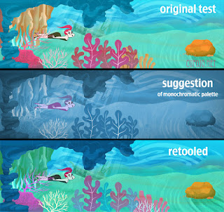
I've often complained of how awful I am at backgrounds, which is the reason I'm so hesitant to move forward with them. Its been a couple weeks since I started stewing this one, and I got a comment that I might benefit from a monochromatic palette. They even sent me an image they mocked up, which I found helpful. I tried to incorporate the suggestion while still keeping the tropical flavor of this scene, and I'm happy to say I hate this background much less than I did before. At least the colors aren't in battle with each other anymore, and that's something. Thank you for the help, sir!


3 comments:
awesome!!! You're not awful with backgrounds at ALL! >__< I've been struggling with the same thing for years, and believe me, you backgrounds are THE BOMB. :)
Keep it up!
mynameisveeyah.blogspot.com
I was once tutored that with backgrounds I would be tempted to use too many colors in the belief that I'll be bringing variety and richness to the scene. Instead, I should keep to a limited palette, say 2 or 3 colors at most, and that the richness and variety will come from their values and tones.
Also, that I should keep in mind (and I think this is a maxim of Maurice Noble's) that the number one function of the background is to support the animation, and that the details and tones of a background should be arrange so that the characters read and focuses our attention on them.
Again, FWIW - just some friendly unsolicited advice :)
-Cheers
Your "20s Glam Gal" illustration demonstrates the above nicely :)
Post a Comment